Contents
- Free Comic Fonts (Licensing Guide + Picks)
- Why Fonts Matter (Clarity, Mood, Speed)
- Licensing Basics (Read This Before You Print)
- Categories You Actually Need
- Shortlist: Reliable Free Comic Fonts
- Step-by-Step: Drop-In Workflow for a New Book
- Sizing & Technical Notes (Print + PDF)
- Mistakes to Avoid
- Where to Get Fonts (Trustworthy Hubs)
- Other Articles That May Help You
- External Links
- FAQ
Free Comic Fonts (Licensing Guide + Picks)
Fonts are more than decoration—they shape tone, readability, and the professional finish of your indie pages. Picking the wrong typeface can muddle dialogue or even cause licensing headaches. This guide shows how to evaluate, license, and implement free comic fonts across print, web, and PDF—without sacrificing clarity or legality.
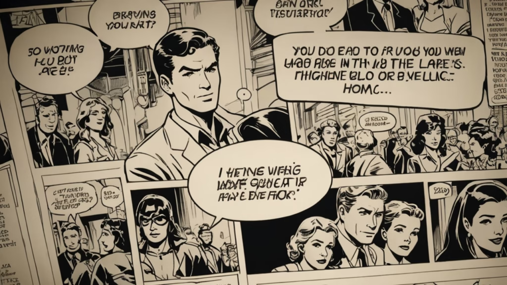
When I prepared my first indie comic, I spent hours browsing free comic fonts. At first, I grabbed whatever looked cool on DaFont and applied it to my dialogue balloons. It looked fine on screen, but when I printed a test copy, the text was fuzzy and hard to read. Worse, I later discovered the font was licensed for “personal use only.”
I panicked, but the experience taught me two things: always test print before committing, and always check the license carefully. For my second book, I used Anime Ace 3 for dialogue and Patrick Hand for narration. Readers told me the lettering felt much more professional, and I finally felt confident that my work could sit proudly next to other circle books at events.
Why Fonts Matter (Clarity, Mood, Speed)
Typography is silent acting. The letterforms in a balloon can speed up comedy beats, slow down dramatic reveals, or telegraph genre before the first panel lands. Good choices for free comic fonts will:
- Maintain legibility at small sizes (9–10 pt in print, ~14–16 px on web).
- Match genre expectations (slice-of-life vs. action vs. horror).
- Survive print constraints (ink gain, paper texture).
- Support accessibility (clear shapes, adequate letter spacing).
Licensing Basics (Read This Before You Print)
“Free to download” is not always “free for commercial use.” The common cases:
- Personal Use Only — okay for tests; not okay for selling books.
- Free for Commercial Use — allowed for paid print/digital (sometimes with attribution).
- Open Source (SIL OFL, GPL) — use/modify/redistribute; keep license files.
- Creative Commons — check each clause (BY/ND/NC/SA) carefully.
Rule of thumb: keep a /licenses folder in your project with every font’s license text and the creator’s URL. Screenshot the source page as proof of terms for your records.
Categories You Actually Need
- Dialogue — neutral, friendly, highly legible.
- Narration/Caption — distinct texture from dialogue (smaller caps, different rhythm).
- SFX — bold, dynamic; often multiple weights for variety.
- Display/Logo — cover titles, chapter heads, logos.
Limit yourself to 2–3 core faces to keep pages cohesive.
Shortlist: Reliable Free Comic Fonts
These are widely used by indie creators and have clear terms (verify before release):
- Anime Ace 3 (Blambot) — clean dialogue standby.
- Patrick Hand (Google Fonts, OFL) — handwritten warmth for narration.
- Bangers (Google Fonts, OFL) — energetic display for titles.
- Komika Axis (Apostrophic Labs) — chunky SFX/action feel.
- CCMeanwhile (Comicraft promo) — classic caption vibe (availability varies).
Where to find them (always re-check licenses): Blambot, Google Fonts, Font Squirrel, League of Moveable Type, and (with caution) DaFont pages that clearly state commercial permission.
Step-by-Step: Drop-In Workflow for a New Book
- Pick categories: 1 dialogue, 1 narration, 1 SFX, optional display.
- Install & name styles: regular/bold/italic as styles in your lettering app.
- Proof on paper: print at final trim (e.g., B6/A5) with 9–10 pt balloons.
- Tighten kerning & leading: avoid tangents with balloon borders.
- Create a style sheet: screenshots + size/leading notes
- Archive licenses: keep license text + creator links in your repo.
Sizing & Technical Notes (Print + PDF)
- Dialogue: 9–10 pt at 600 dpi lineart; leading ~120–130%.
- Narration: 0.5–1 pt smaller than dialogue; extra letter-space for tone.
- SFX: outline/expand at high resolution; test on uncoated paper.
- Export: embed fonts in PDF/X presets or convert to outlines when required by your printer (keep an editable source file with live text!).
Mistakes to Avoid
- Using five different faces on one page (visual noise).
- Treating all free comic fonts as legally identical.
- Skipping print tests (ink spread can blur counters in tight letters).
- Over-tight kerning making letters “kiss” balloon strokes.
- Forgetting multilingual support if you plan translations later.
Where to Get Fonts (Trustworthy Hubs)
- Google Fonts — OFL license; broad language support.
- Blambot — indie-friendly terms; read each font page.
- Font Squirrel — pre-filtered for commercial use.
- League of Moveable Type — open-source foundry.
- DaFont — mixed licenses; read the “Free for Commercial Use” label carefully.
Re-download from original sources before release to confirm nothing changed.
Other Articles That May Help You
- How to Self-Publish a Comic (2025 Guide)
- Doujinshi Printing: Specs, Costs, and Mistakes to Avoid
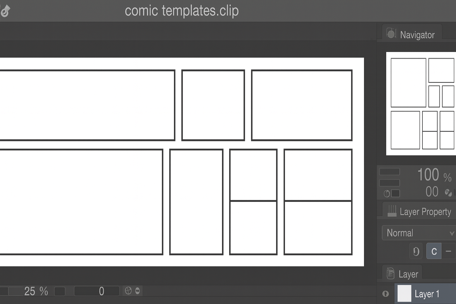
- Free Comic Panel Templates: Download & Use Guide
External Links
- Blambot Fonts
- Google Fonts
- Font Squirrel
- League of Moveable Type
- DaFont Comic Section
- PrintNinja: Comic Printing Guide
FAQ
Q1. Are all free comic fonts safe for print sales?
No. Some are personal-use only. Confirm commercial permission before publishing.
Q2. What’s the safest license for indie creators?
SIL Open Font License (OFL) is flexible and reliable for most projects.
Q3. Should dialogue and narration use different fonts?
Yes—difference improves clarity and voice separation without visual noise.
Q4. Do I need to convert SFX to outlines?
Often yes, especially when applying strokes, gradients, or distortions for print.
Q5. How many fonts should a book use?
Two to three: dialogue, narration, plus SFX or display. Keep the system consistent.